Design a website through UI and UX analysis – our experience
When we embarked on this adventure, we told ourselves: the coordinated image and the TeamPeaks website will be the result of our collective work. And so, it was!
The Working Method
We understand that designing a website is not a simple, linear process: it requires analyzing needs, identifying values, and defining concrete objectives. To create our site, we chose a collective working method, involving everyone in TeamPeaks. Each team contributed with its experience and expertise, complementing each other to achieve the project’s goals.
The Design (UI and UX…and more)
- How do our competitors present themselves?
- What is their tone of voice?
- What graphic style do they use?
Among the competitors, the general trend was to use very technical and sector-specific language together with impersonal images. What was missing, and this is fundamental for TeamPeaks, was the focus on the individuality of people. This is what we aimed to address on our website.
Let’s consider what instead inspires us: in his book “Emotional Design: Why We Love (or Hate) Everyday Things,” Don Norman outlines three levels of design:
- Visceral Design: how the user perceives the design and the emotions that derive from it
- Behavioral Design: the actions the user takes within the site
- Reflective Design: a more reflective level that prompts the user to ask questions about the meanings of the elements
Our graphic design process considers all these aspects: emotion, action, reflection.
The intention is to accompany the observer into our world, showing the various facets of the “diamond”: our skills, our competencies, the objects that represent and inspire us, talking about us and how we work.
For this reason, we chose to create an illustrated iconography.
Our Symbols:
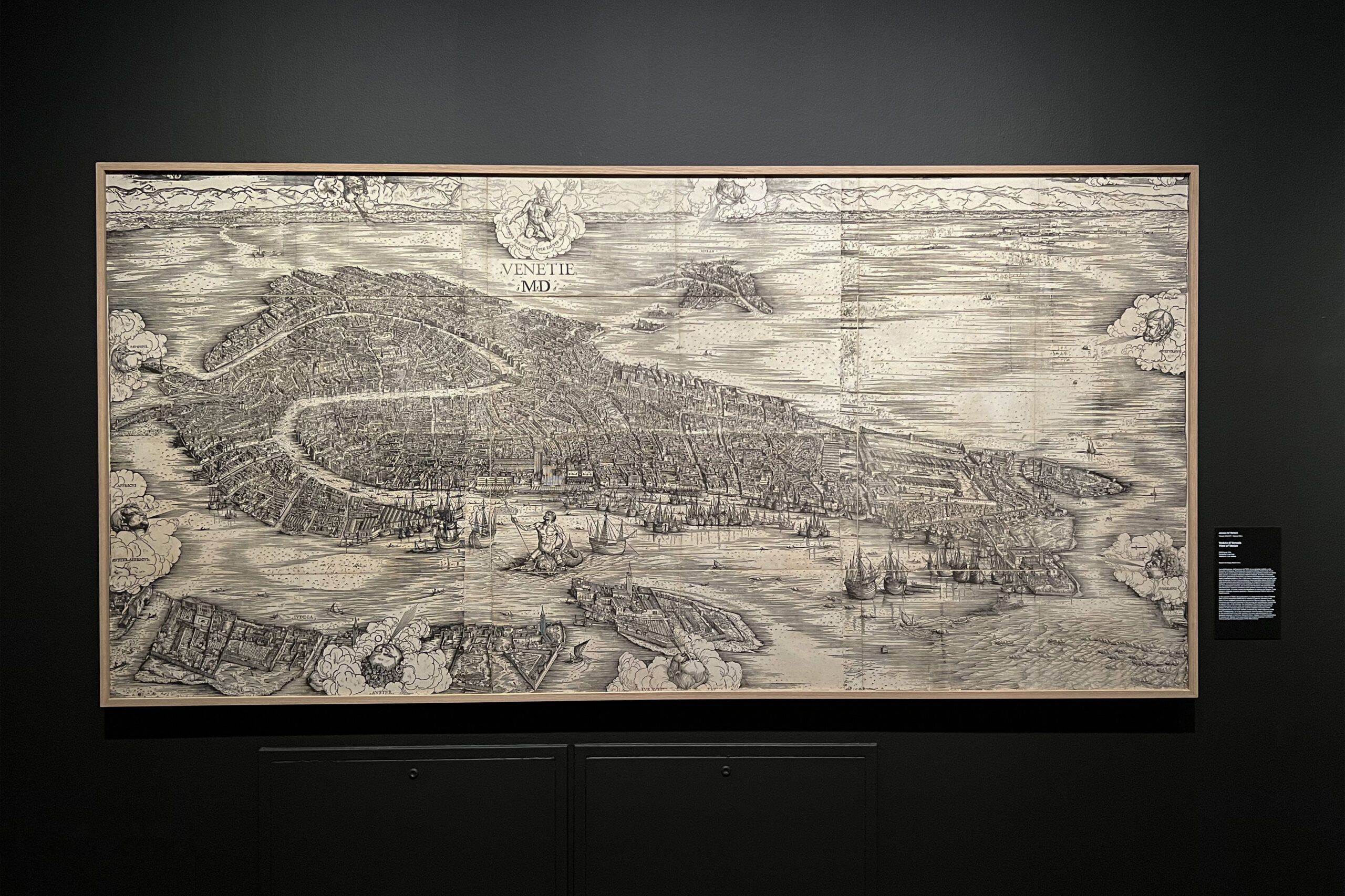
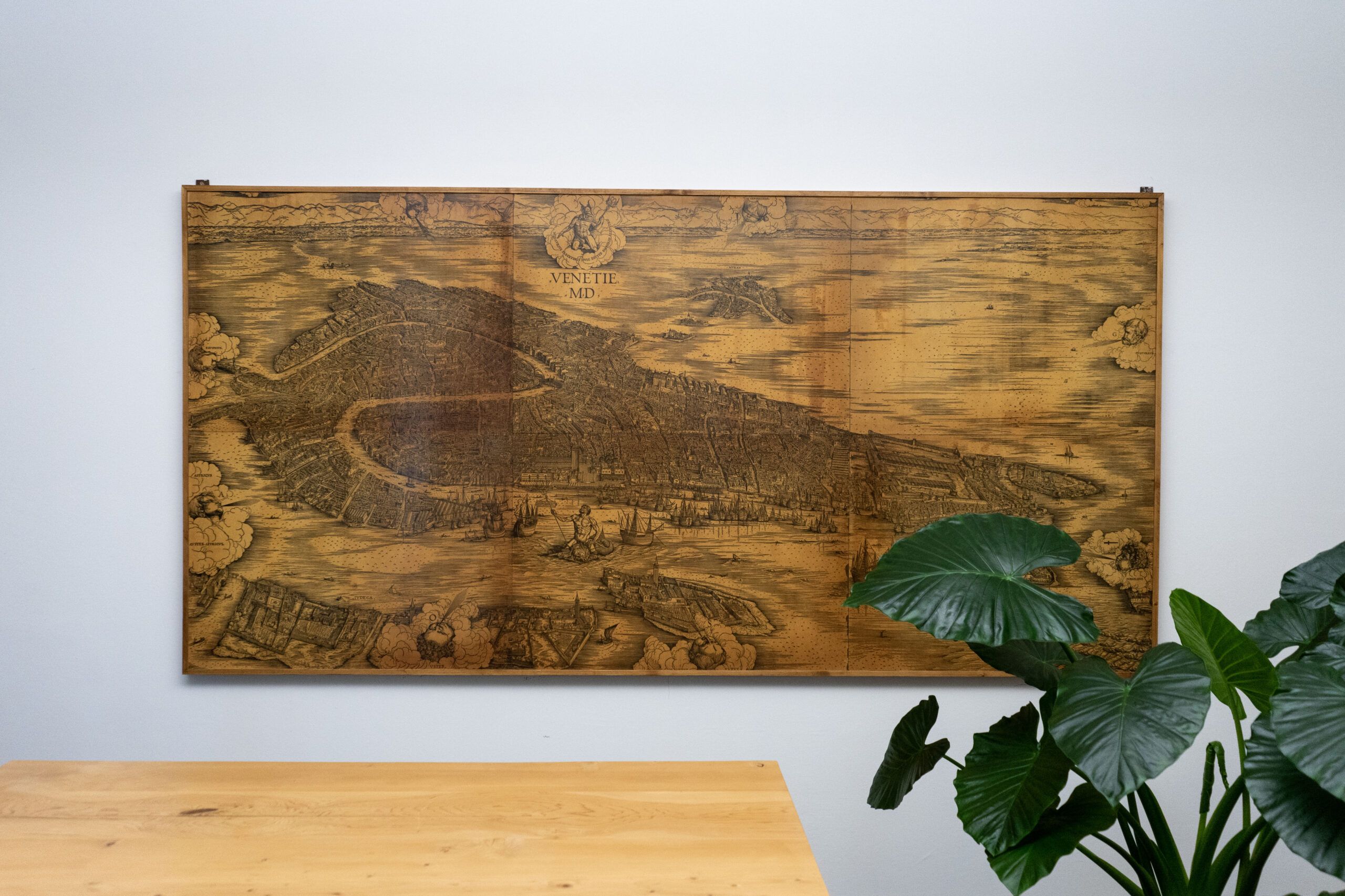
Many of the illustrations on our website are inspired by a famous 1500 engraving by Jacopo de’ Barbari, which is displayed in one of our offices.


This ancient technique is reinterpreted in a modern way on the site, with a style that aims to blend modernity and craftsmanship. This concept of craftsmanship is central to our working method: each project is unique and tailored to the client’s needs and objectives.
The Whistling Kettle

The Whistling Kettle
The Trail Map

The Trail Map
The Kintsugi Plate

The Kintsugi Plate
The Tandem

The Tandem
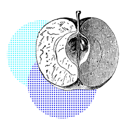
The Apple

The Apple
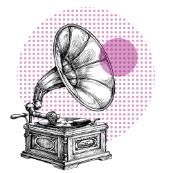
The Gramophone

The Gramophone
We are not a web agency, but we understand the principles of UI and UX design well enough to leverage their potential. We stay updated with web design trends and can independently produce visual content, including illustrations, photos, animations, and videos. Additionally, we can add interactivity and animated effects to our content to enhance user appeal and engagement.
We have applied this knowledge to online training, creating e-learning content and custom configurations for the LMS platforms we administer.
Do you like our site? Would you like to see our portfolio?
Reach out to us and ask for a demo!

