Turn data into action with People Analytics
Do you remember that time at school when the teacher questioned you about that chapter of the book you had only skimmed through and read absentmindedly?
And do you remember how those few images and flow charts shown on the pages saved you from a bad grade? Well, this is just a testament to how powerful images are for your mind compared to text.
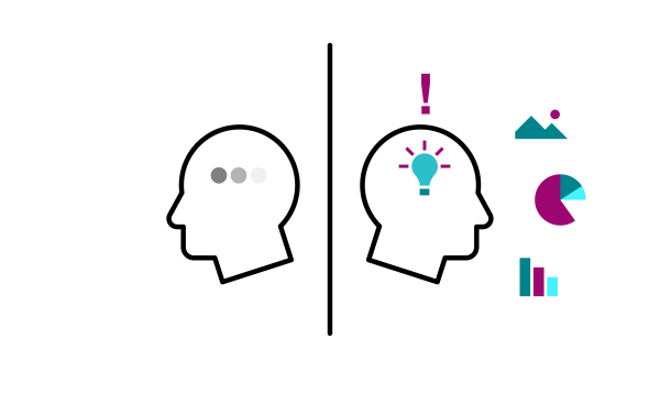
The human brain process visuals 60,000 times faster than they do text so, why not take advantage of this natural propensity to improve business monitoring rather than forcing workers into outdated and cumbersome reporting methods? After all, as we say in Italy, it makes no sense to “mangiare il brodo con la forchetta”(literally: eat broth with a fork).
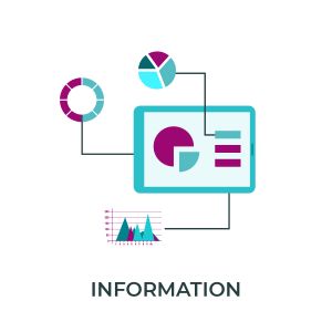
Information
Trend, KPIs, Benchmark
Display a clear indicator to summarize data:
a Trend line, a Gauge or similar graph.
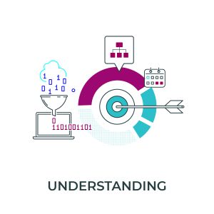
Understanding
Data Analyzer, Drill Down, Filters, Sorting
Provide the user with tools to break down
and analyze the indicator
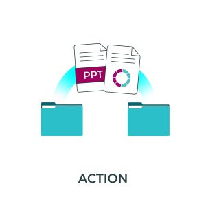
Action
Exports, PowerPoint, executive report,
Views sharing and comments.
Allow for quick and easy ways to obtain details on actions to take and share the outcome of the analysis (lists, executive reports, PowerPoint presentation).
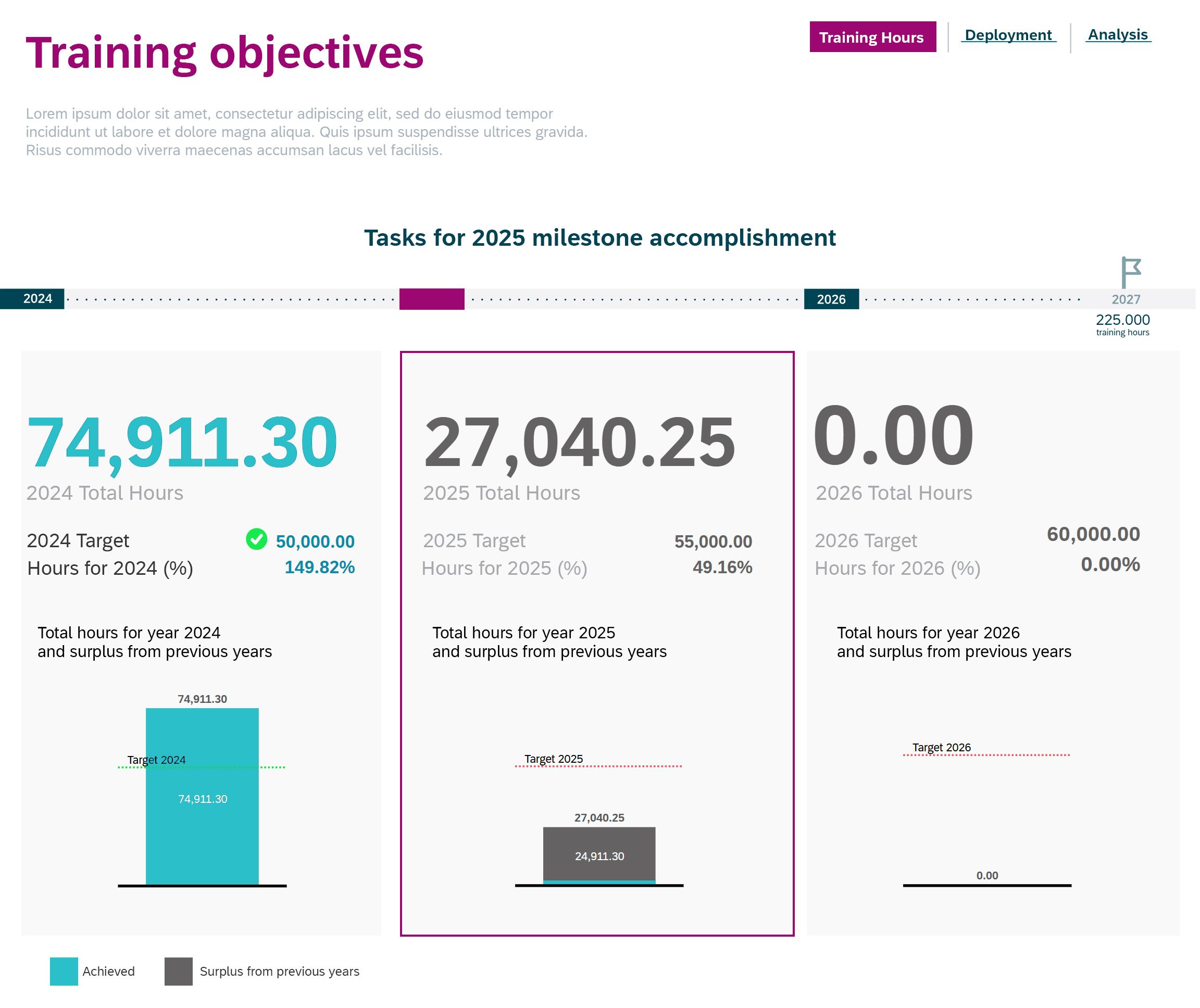
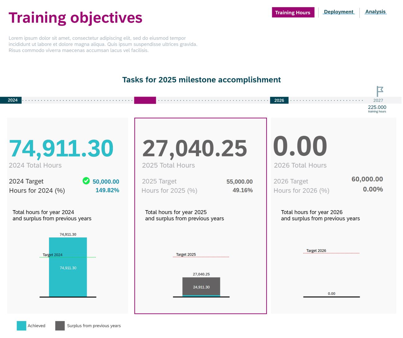
SAP People Analytics responds promptly to this call by providing an agile and intuitive tool that allows you to create useful dashboards to monitor KPIs and metrics from different SuccessFactors modules under one location at a glance. With these real-time data always available, decision-makers can make well-informed decisions quickly, increasing operations’s efficiency.
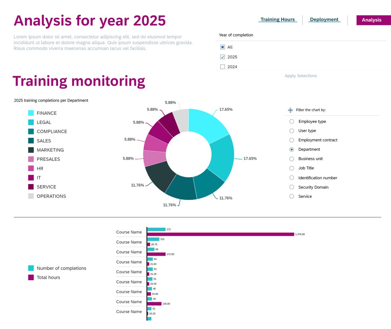
Real time dashboards developed in People Analytics incorporate interactive features that enable users to dive deeper into the data. Filters and drill-down capabilities help tailor the dashboard experience to a particular user without waisting time in the creation of new user-specific reports.
The only time consumed will be in setting up the dashboard, which can then be shared and used by all stakeholders who need it.
There is no doubt that data visualizations play to our brains’ strengths.
Let’s exploit this resource to improve the way we work!
Reach out to us and ask for a demo!


